Context.
The problem
Across the MENA region, the gap between a person with a question and a doctor with an answer is mostly bureaucratic — long waits, scattered phone numbers, no easy way to find a verified specialist nearby. The TeleTabeb founders wanted to close that gap with a phone.
Our approach
We built TeleTabeb as a four-pillar product — Home (consult), Clinic (a public Q&A feed of doctors and patients), Create (post questions or articles), and Maps (find verified clinics nearby). Bilingual from day one. Native iOS, native Android, a single Node backend, all designed to feel calm rather than clinical.
The outcome
TeleTabeb shipped to the App Store and Play Store and now serves patients across the UAE and the wider region. Doctor verification is gated; every post and profile carries a credential badge. The app's daily content (the Clinic feed) keeps it open and trusted — not just transactional.
What we built.
A small surface area, deliberate. Each tab does one thing well, and the four together make a self-sustaining loop: ask, answer, learn, find.
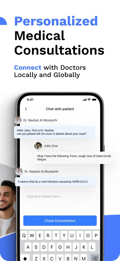
Consult Now
A single primary action on Home. Pick a specialty, post a question, get an answer from a verified doctor. Optional public-vs-private toggle.
The Clinic feed
Every approved consultation can be made public — building a searchable library of real Q&A. Patients learn from each other; doctors build authority.
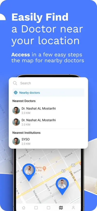
Maps
A live map of nearby verified clinics and doctors. Cards open into the same profile surface used elsewhere.
Verified profiles
Doctor onboarding includes credential review. Verified accounts get a blue check across the entire app.
Bilingual UI
Built RTL-first. Arabic and English share components; layout, icons, and motion all flip cleanly when the language changes.
Create
Patients post questions; doctors post articles. The same composer powers both, with different review pipelines behind it.
Four screens, four jobs.
Real screenshots from the shipping app. The product is bilingual (Arabic + English), so every screen had to read both ways.
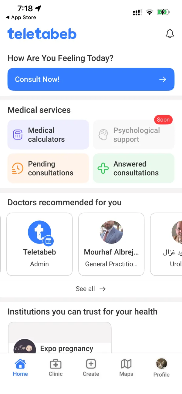
Consult, browse services, see recommended doctors.
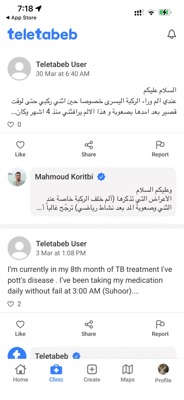
A feed of public consultations — questions, answers, expert reactions.
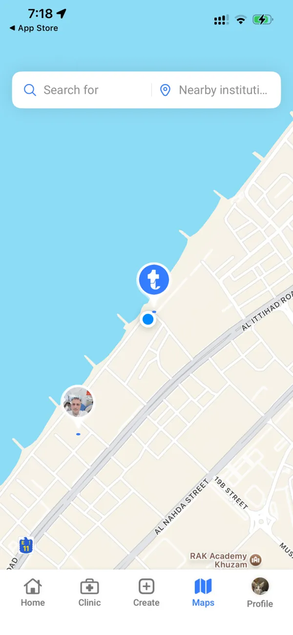
Find verified clinics and doctors on the map nearby.
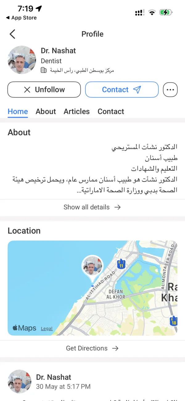
Doctor profile with verified credentials, articles, and location.
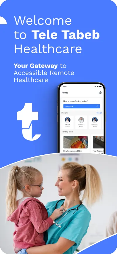
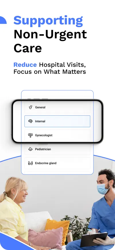
Marketing artwork.
We designed the App Store gallery in lockstep with the product. Same blue, same typography, same "t". The rest is photography and copy crafted to land in the first three screens.
The stack.
"We came in with a clinical brief. Dracode came back with a product. Bilingual, two stores, one team — and they sweat the App Store screens with us, not after us."